Article: Abstract Venice

All the Colors of Venice
For anyone who hasn't been there, Venice is an indescribable place, from how she was built to the way people live and traverse this labyrinth of water, landfill, and pieces of actual dry earth.
Palaces rise right out of the water. Buildings are constructed so closely together that pedestrian paths carved in between are barely wide enough to let two people pass. And then after one is completely sure that manmade claustrophobia rules, walks suddenly empty into spacious squares and seaside promenades offering clear vistas of the Laguna.
But perhaps the most preposterous thing about this absurd fairytale of a place is the color that abounds. "Venice is a shattered rainbow built into a city," observed an architectural traveler more than a century ago. And while it would appear that Venice is an enduring spectacle whose appearance has remained the same for centuries, on a subtle level, the city's palette is constantly changing.
The primary colors that define Venice--variations of red, ochre, and blue--are actually dictated by law. But this has hardly constricted the local artistic nature. Aquamarine window shudders contrast wonderfully against various shades of rust. When buildings share a common wall, owners don't often miss the opportunity to make something of the divide. Over time, plastered surfaces, on which so much of the colors of Venice are affixed, weather and fade with rich patina and flake artistically into the canals revealing brick foundations from centuries past. When looking beyond the city's stunning architecture, these examples of color and composition define the Venice everyone knows--whether they realize it or not.
In studying Venice in this manner, I soon began to realize additional elements that are shaping its surface.
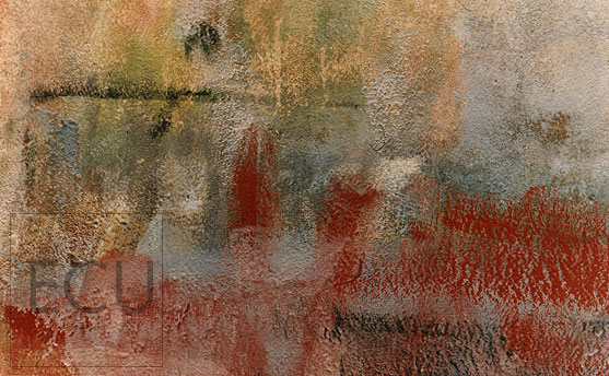
When Venetians are finished painting a chest or a boat al fresco, cleaning their brushes first involves a good swipe along the closest wall. It may be a parapet bordering a canal like the rio tera San Isepo, a barn in Murano, or a street near San Marco. The layering of these smears over time, from different brushes dripping various colors, has resulted in some pretty messy looking walls. But peer in a bit closer and once in a while you can uncover some remarkable pieces of modernism. Was the art of Rothko and Kandinsky genius or had they simply taken a look at what came naturally to Venetians?
More selfishly-minded graffiti is also changing the look of the city . Why anyone would feel anything less than felonious in spray painting this jewel of a place escapes me. Still, some local kids seem to prefer the palette of the New York City subway system. And on the rare occasion, the layering of some light-handed vandals have produced a striking look.
But where graffiti has generated an intriguing imagery is when owners bother to clean it up. Even when using the same background color that's been sitting in a can rather than aging on a wall, building owners have often created Ad Reinhart likenesses involving the monochromatic overly of patterns over patterns. The result at times looks like something out of the Peggy Guggenheim collection.
Venetian color is certainly not restricted to the walls of the city. From the tiles of San Marco to the glass of Murano, the handpainted fabrics of Norelen and the undulating chromatic swirls of Venetian papery found in stationary shops around the Laguna, the city inspires.
However, I much prefer discovering the inadvertent works of art that lay secreted away along the small side streets of Venice. Focusing in tightly to uncover design from what otherwise appears as anonymous jumble of paint has helped me produce an unexpected look--not an easy task when dealing with perhaps the world's most looked at place.
Eric Uhlfelder
New York City
March 1998